> ## Documentation Index
> Fetch the complete documentation index at: https://docs.makemypass.com/llms.txt
> Use this file to discover all available pages before exploring further.
# Form Builder
> The Form Builder is where event organizers create and customize the registration form for their event.
## Default Fields
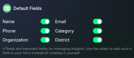 Some fields are essential for the functioning of the application and are linked to other features. These fields include:
If you need any of the above fields in your form, use the toggle provided instead of creating a custom field with the same name.
## Form Fields
Some fields are essential for the functioning of the application and are linked to other features. These fields include:
If you need any of the above fields in your form, use the toggle provided instead of creating a custom field with the same name.
## Form Fields
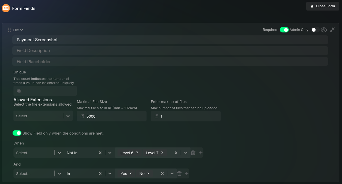 This section lists all the fields included in the event registration form, in the order they appear.
* To create a new field, click the **"Add Question"** button, which adds a new text field to the form.
* To edit a field, simply click on it, and the field will expand to reveal its settings.
* To delete a field, click the delete icon next to the field.
* To duplicate a field, click the duplicate icon at the right end of the field.
## Form Field Structure
A form field consists of five key sections:
1. **Title** - Displayed as the form field label.
2. **Description** - Shown below the label; supports HTML formatting.
3. **Placeholder** - Displays hint text inside the input field.
4. **Form Field Settings** - Additional configurations for validation and restrictions.
5. **Form Field Conditions** - Conditions that determine when the field is displayed.
### Field Visibility and Requirements
Each form field has additional controls to manage visibility and requirements:
* **Required** - When enabled, this form field must be filled before submission is allowed.
* **Admin Only** - When enabled, this field will only be visible to administrators and not to users filling out the form. This is useful for maintaining administrator-specific information.
* **Hide Field** - You can hide a field from users without making it admin-only by clicking the eye button in the top right corner of the form field.
### Form Field Settings
Each form field can have additional settings to enforce specific rules:
* **Unique** - Defines how many times a unique value can be entered.
* Example: If an email field has a unique value of 2, the same email can be used to submit the form twice.
* **Max Length & Min Length** - For text fields, sets character length limits.
* **Allowed Extensions** - For file fields, restricts file types.
* **Maximal File Size** - For file fields, sets the maximum file size allowed.
* **Max Number of Files** - For file fields, limits the number of files that can be uploaded.
### Form Field Conditions
Form fields can be displayed based on previous user inputs.
**Example:** The **College** field can be configured to appear only if the user selects "Student" as their category from the dropdown.
## Option Groups
This section lists all the fields included in the event registration form, in the order they appear.
* To create a new field, click the **"Add Question"** button, which adds a new text field to the form.
* To edit a field, simply click on it, and the field will expand to reveal its settings.
* To delete a field, click the delete icon next to the field.
* To duplicate a field, click the duplicate icon at the right end of the field.
## Form Field Structure
A form field consists of five key sections:
1. **Title** - Displayed as the form field label.
2. **Description** - Shown below the label; supports HTML formatting.
3. **Placeholder** - Displays hint text inside the input field.
4. **Form Field Settings** - Additional configurations for validation and restrictions.
5. **Form Field Conditions** - Conditions that determine when the field is displayed.
### Field Visibility and Requirements
Each form field has additional controls to manage visibility and requirements:
* **Required** - When enabled, this form field must be filled before submission is allowed.
* **Admin Only** - When enabled, this field will only be visible to administrators and not to users filling out the form. This is useful for maintaining administrator-specific information.
* **Hide Field** - You can hide a field from users without making it admin-only by clicking the eye button in the top right corner of the form field.
### Form Field Settings
Each form field can have additional settings to enforce specific rules:
* **Unique** - Defines how many times a unique value can be entered.
* Example: If an email field has a unique value of 2, the same email can be used to submit the form twice.
* **Max Length & Min Length** - For text fields, sets character length limits.
* **Allowed Extensions** - For file fields, restricts file types.
* **Maximal File Size** - For file fields, sets the maximum file size allowed.
* **Max Number of Files** - For file fields, limits the number of files that can be uploaded.
### Form Field Conditions
Form fields can be displayed based on previous user inputs.
**Example:** The **College** field can be configured to appear only if the user selects "Student" as their category from the dropdown.
## Option Groups
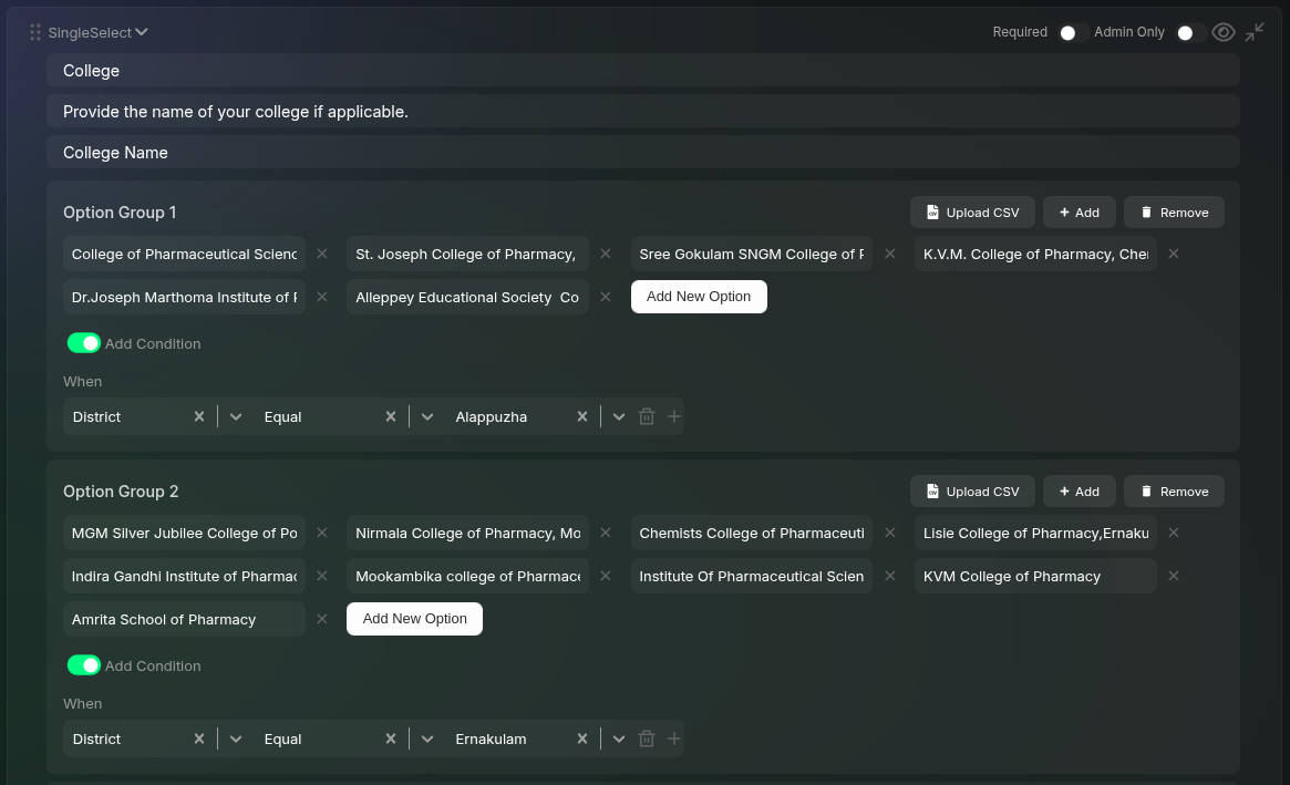 For **Single Select** and **Multiple Select** fields, an additional section called **Option Group** is available.
* Each dropdown field must have at least one default option group without conditions.
* Option groups allow conditional rendering based on user selection.
* For large option sets (e.g., 100+ options), you can upload options as a CSV file instead of manually entering each one.
**Example Use Case:**
If there are two dropdown fields:
1. **"Select Your District"**
2. **"Select Your College"**
* Multiple option groups in the **college dropdown** contain lists of colleges for each district.
* Each option group is conditionally displayed when its respective district is selected.
## Supported Form Field Types
We support commonly used form field types, including:
You can add multiple **Phone**, **Email**, and **Name** fields, but the one from the **Default Fields** section will be used as the primary identifier for guests across the platform (e.g., emails will be sent to the email entered in the default field).
## Closing the Form
For **Single Select** and **Multiple Select** fields, an additional section called **Option Group** is available.
* Each dropdown field must have at least one default option group without conditions.
* Option groups allow conditional rendering based on user selection.
* For large option sets (e.g., 100+ options), you can upload options as a CSV file instead of manually entering each one.
**Example Use Case:**
If there are two dropdown fields:
1. **"Select Your District"**
2. **"Select Your College"**
* Multiple option groups in the **college dropdown** contain lists of colleges for each district.
* Each option group is conditionally displayed when its respective district is selected.
## Supported Form Field Types
We support commonly used form field types, including:
You can add multiple **Phone**, **Email**, and **Name** fields, but the one from the **Default Fields** section will be used as the primary identifier for guests across the platform (e.g., emails will be sent to the email entered in the default field).
## Closing the Form
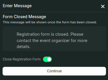 If you need to close registration before the event itself, you can use the "Close Form" button located in the top right part of the form fields section.
When clicked, this button opens a modal that allows you to:
* Enter a message that will be displayed to users when they visit the closed form
* Enable the "Close Registration Form" toggle to officially close the form
Once you've configured these settings, click "Continue" to save the changes. After closing the form, users will no longer be able to submit registrations and will instead see your custom closure message.
If you need to close registration before the event itself, you can use the "Close Form" button located in the top right part of the form fields section.
When clicked, this button opens a modal that allows you to:
* Enter a message that will be displayed to users when they visit the closed form
* Enable the "Close Registration Form" toggle to officially close the form
Once you've configured these settings, click "Continue" to save the changes. After closing the form, users will no longer be able to submit registrations and will instead see your custom closure message.